Reimagined HFC website, update #2

T he HFC web team has been working for the past several months to develop a re-imagined HFC website experience (code-named “HawkCentral”) to address the needs of incoming and returning students. While other important website audiences (such as alumni, community partners, visitors, and HFC employees) will have content and services on the website, the core of our development of content, navigation, and the overall user experience (UX) will be students. You can read more about the motivation and vision of this project in update #1.
This project is tightly aligned with the priorities and goals of the HFC strategic plan. You will see clear evidence throughout this project that our core focus is on student success.
While the main objective of this project is to improve the organization and overall experience for our visitors, the project will also modernize the website to freshen the look and bring many behind-the-scenes improvements.
Why this project, and why now?
Our last major website redesign happened when Internet Explorer was still a predominant web browser, in about 2018. The upcoming redesign and technical redevelopment represents a fresh start without any of the outdated techniques and workarounds required in previous versions of the website.
The project will include four major components, over a timeline of two or three phases:
- An overhaul of the website’s design
- An overhaul of the website’s technical backend
- A redevelopment of the website’s information architecture (organization)
- Improvements and enhancements to the website’s content
Our website runs on a technical platform called Drupal. The current version of this platform was built 10 years ago. While we've been making steady improvements over the years, it is time to move forward to the most current Drupal 10 release, which brings major changes to the content creation and editing process and will better align the HFC website with the College’s catalog. This update will also bring usability and reporting improvements to the many fillable forms on HFC websites.
Where does the project stand today?
During the Fall semester, the web team has been working to prepare, research, and plan the new website. We've worked with the College's institutional research team to survey students to identify their most important needs. We conducted research to identify student “pain points” in our current navigational structure. We have also consulted a global user experience (UX) expert, who has provided helpful guidance and aid to plan the research phase and interpret the research results. He will continue to assist our team throughout the project.
After many long meetings and testing sessions, the new website platform is nearly complete. Some of the new content management tools have been production tested through redesigns of the key pages in the College catalog. We've also developed custom tools to rapidly migrate content to the new website as we start to actually build out the website that you will see after we launch it.
Our designers have been working on visual changes and enhancements, which are outlined in more detail below.
What are the next steps for Phase 1 and Phase 2? How can I get involved?
Using the information we have gathered during the Fall semester, the web team has developed an aggressive timeline to migrate the HFC website to the new platform and redesign several key pages during the Winter semester. These efforts are highly focused on removing barriers to student success. We have started designing these new pages, and will begin assembling content in January. This process will continue through the Winter semester. We expect these changes to be launched by May. We are calling this Phase 1 of the project.
We've spoken informally about this project with a number of our colleagues. In the early part of 2024, we will contact HFC teammates across campus to gather more detailed employee input to help plan changes to related webpages. This will be a rapid process in which we will focus first on changes that provide immediate improvements for the recruitment, enrollment, and retention of students. We will ask you to provide this kind of feedback in time for us to include any feasible elements during Phase 1.
We will also continue working with students to test and refine our changes as we build out Phase 1 of the new website.
As new concerns and more substantial potential changes emerge from our colleagues and from students, we will schedule those for further analysis and planning after the initial launch, in Summer and Fall 2024. We are calling this Phase 2 of the project.
Depending on the scope of the changes that might emerge for Phase 2, we will determine whether an additional phase is needed.
Ongoing efforts
All aspects of our website redevelopment will adhere as closely as possible to best practices including DEIB principles, usability/user experience principles, and accessibility principles.
The HawkCentral project will not end with the new website launch. Our immediate objective is to improve the HFC website experience and remove barriers for high school seniors and adult students planning for college, and for current students preparing to register for Fall 2024 classes. This first phase lays the groundwork for HawkCentral's more ambitious goals for Phase 2 and beyond.
Questions? Reach out to communications@hfcc.edu or a member of the Web Team.
More detailed information about our research and site planning are below.
Digging into our research with HFC students
W ith the help of the office of Institutional Research and Business Intelligence, the Web Team contacted every student enrolled in the Fall 2023 semester asking for help redesigning our website. Just over 400 students signed up to participate in activities and surveys intended to help us understand what our goals should be for navigation and structure.
First research activity
The first activity the team ran was called a Top Tasks Analysis. We asked students to think back to when they were getting started at HFC, or even thinking about college, and share their ideas for what needed to be easiest to find on the website. Students could also “like” other students’ submissions.
Students were largely in agreement about the importance of easy access to Moodle and Hawkmail for current students, as well as information on classes, which classes to take, and whom to talk to about making those decisions.
In the end, this test showed that we have the right information on our website. Then we needed to know whether or not students can find this information.
Second research activity
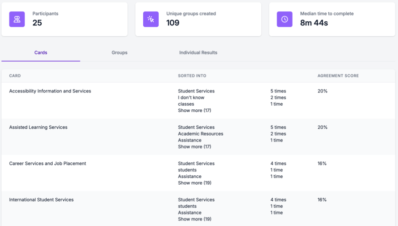
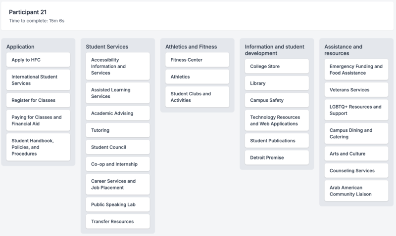
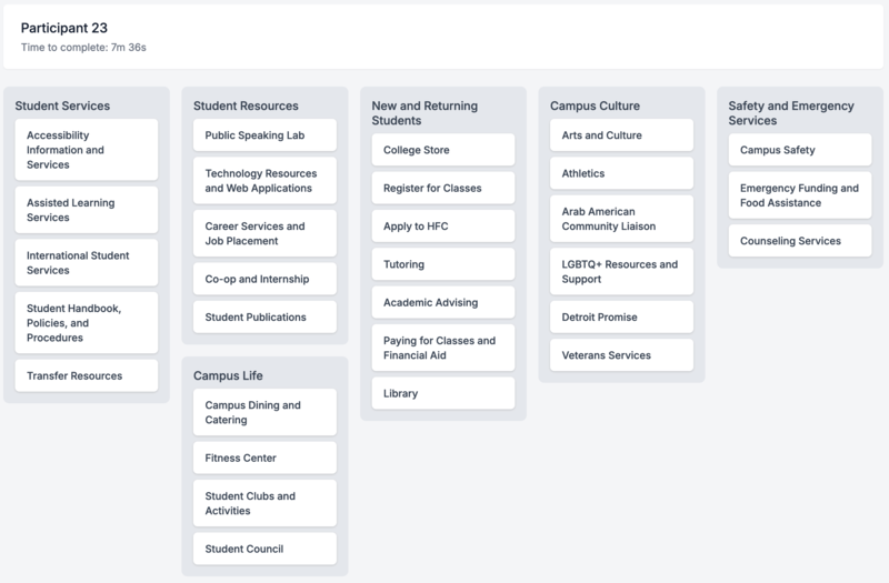
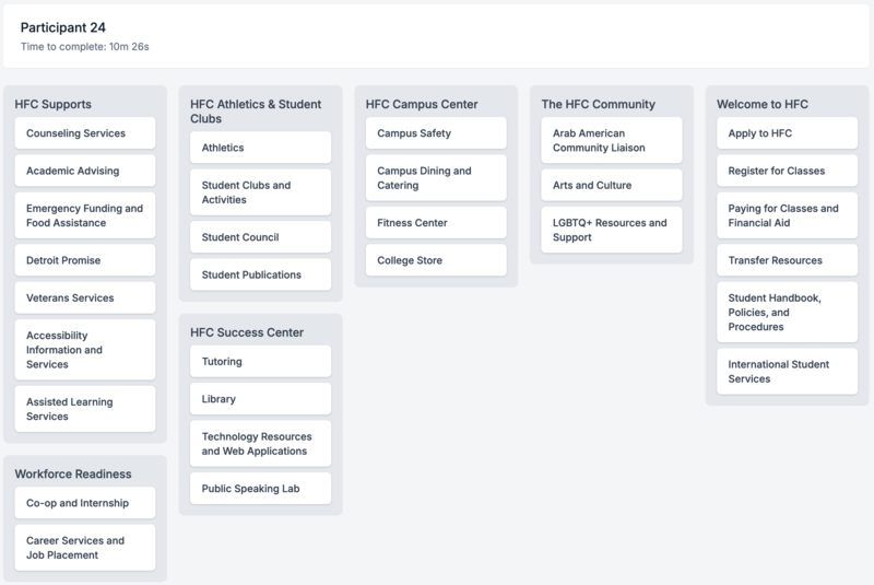
The second activity was an open card-sorting exercise. Students were given 30 topics currently found on our website (such as Academic Advising, Emergency Funding, Tutoring, etc.) and were asked to come up with new ways to categorize them.
The initial results demonstrated very little consensus among the participants, so we worked with our consultant to analyze the data and combine the results. In the end, we determined that most of the content flows into three existing pages: Student Services, Campus Life, and Campus Resources.
Additional testing was needed to review the organization of those pages and test the navigation. Images of some of these exercises are below.
Third research activity
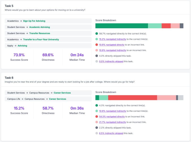
The most recent activity we have run is a tree test. We re-created our website’s navigational structure as a clickable tree-style menu and gave students a short series of tasks, pointing them toward something on the website. For instance, “It's time to sign up for your classes. Where would you look for more information on how to do that?” and “Imagine you need extra help with an assignment in your math class. Where would you look?”.
We found a very mixed set of results with this data, and will continue to work on navigation improvements in the coming months.
We understand that the majority of website users who do not know where to look or who do not immediately find what they are seeking will use the website’s “search” function. But we want to make sure the navigation and structure of our site are as user-friendly and barrier-free as possible for all users. Some images of this research activity are below.
Visual redesign of the website (sometimes called “look and feel”)
W e have started designing new pages with a focus on improving the visual hierarchy, accessibility, flexibility, and helping our users easily get to the actions they came to the website to complete.
Updates to our web platform will allow us more freedom and creativity in page layout, which will also be reflected in our new site design patterns.
One of our biggest challenges -- which is similar to many other complex educational institutions -- is related to our visual hierarchy. Many of our landing pages are content-heavy, so it can be difficult to find the specific information you need when everything has the same “weight,” or basically the same visual distinction, as many other elements on the page.
To address this challenge, we're working to optimize our use of color, contrast, spacing, and scale to better guide visitors to important information, instead of working through multiple single-column paragraphs to find what they need.
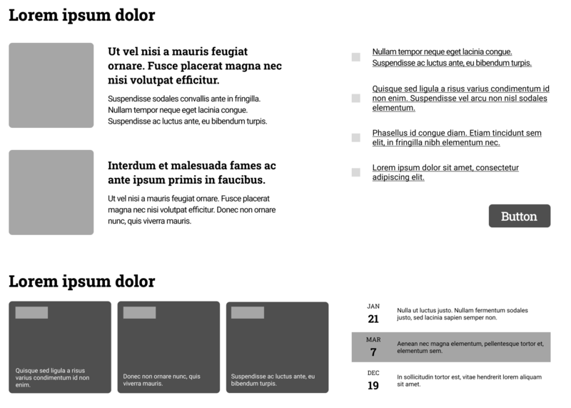
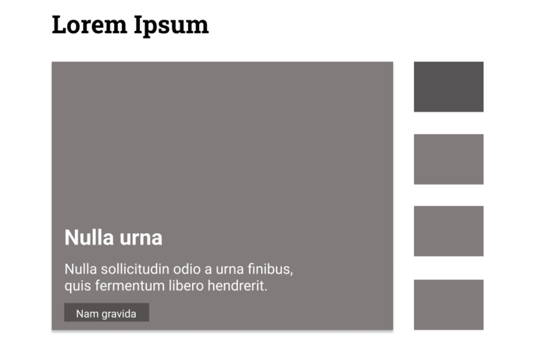
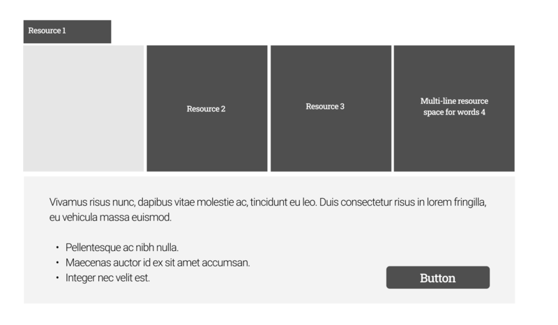
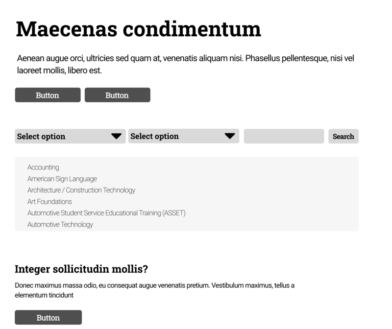
One of the elements of this project is to create wireframes, which are basic outlines of different layouts we can use to reflect our design goals. Below you will find some examples that we've been working on. These examples are preliminary, and they contain no specific content, but they are helping us think in new ways. We are designing with the intent that these layouts and sections will be interchangeable, optimizing the way we build webpages in the future.
Our next steps in this process will be to solidify layout options, build our design library with reusable components like buttons, links, and form fields. We will then prepare detailed mockups of our top landing pages, our home page, and other flexible templates. (The “fake Latin” text you see here is intended to give us a sense of text spacing, sizing, and proportionality without being distracted by readable text during the wireframing process.)
